Posts Tagged ‘nokia lumia 800

15
Aug
12

Nokia Lumia 900 First Impressions

nokia-lumia-900A couple of months ago I wrote a series of reviews about the Nokia 800 which, if you want to kill a good 20 mins, you can read here, here, here and here.

I quickly became inhumanly attached to the Lumia 800 and at the end of the review period, I felt like I was losing a limb when I had to return it.

So when the kind folks at Nokia contacted me about reviewing the Lumia 900, I jumped at the opportunity to sink my teeth into this new addition to the Nokia Windows Phone family.

This review is just going to touch on my first impressions setting up and using the phone, I’ll get into more detail over the next few weeks.

The first thing that struck me about the Lumia 900 is how impressively huge it is.


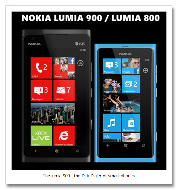
If you compare the phone size wise to the Lumia 800, the Lumia 900 is 127.8 x 68.5mm where as the Lumia 800 is 116.5 x 61.2mm. So the Lumia 900 is basically a centimetre taller and half a centimetre wider than its predecessor.

Doesn’t sound like much, but have a look at the two in a side-by-side comparison and the difference is massive.


It’s a far cry from a Galaxy Note, but I must admit when I first saw how much bigger it is compared to the Lumia 800, I thought they may have taken things a bit far.

However, after a couple of days of use I quickly got used to the increased screen size and found that it makes things like browsing (which was an issue with me on the Lumia 800) and basic menu and app navigation pretty slick.

Also, viewing pictures and videos is a whole other experience with this phone. The 480 x 800 pixel screen means images are crisp and clear and the few experiments I’ve done so far with streaming video from YouTube have produced some impressive results thanks to the device’s download speeds which are nearly 2x faster than the Lumia 800.


There are a shiteload of similarities between the Lumia 800 and the Lumia 900 though so a lot of the stuff I covered in my Lumia 800 review will apply to the Lumia 900, but the longer I use this phone, the more subtle differences I pick up.

At this stage, I’d say that the Lumia 900 is more suited for people who want a smart phone that browses like a demon, handles multimedia content with ease and streamlines all your email and social media accounts so that communicating with your contacts as easy as falling off a piece of cake.

I’ll post more thoughts on this phone next week, but needless to say my initial impression has been very positive, but let’s see how the Lumia 900 holds up once I start seeing what this bad boy is really capable of.

-ST

05
Apr
12

The Nokia Lumia 800 Closing Thoughts

nokia-lumia-800-wp7-review-2My review of the Nokia Lumia 800 is drawing to a close so I figured I’d wrap things by checking out the Nokia Maps that come standard with the phone, giving a write-up of the browsing experience and covering some gripes I have with the phone (if I can think of any).

Before I jump into that though, it’s worth mentioning that after updating the phone, my battery life has vastly improved. I can now easily get a full day’s charge out of the phone with medium to heavy use, which is pretty much par for the course with most smartphones these days.

Nokia Maps

The Nokia Maps on the new Windows 7 phones are ridiculously amazing. I was already sold on Nokia Maps because when we were in Thailand earlier this year, the maps on my N8 saved our lives. There’s no way we would have been able to find our way around Thailand without J-Rab checking the maps on the back of our scooter while I did my level best not to kill us both.


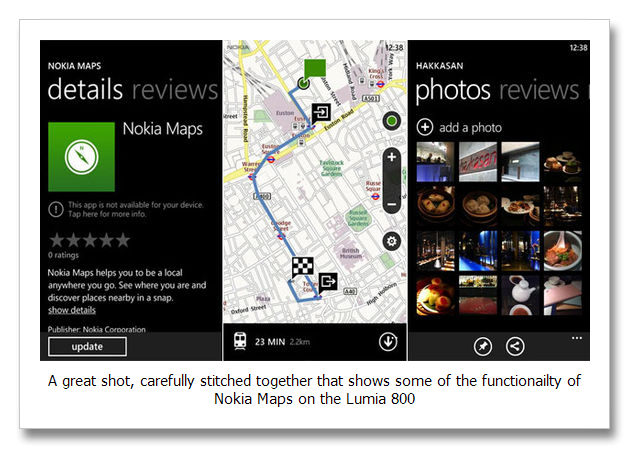
On the Lumia 800, the maps have been given an impressive facelift. Everything from the way the maps render to how quickly they load has been improved and if you’re connected to a WiFi hotspot the load time is about 5 seconds at most. Like Google Maps, you have an option to switch to satellite view so you can zoom right in to where you’re standing and watch yourself waving to the camera.

Not quite, but you get the idea.

It also has a handy “places” option which will list all the rad things close to you including listed according to “Popular”, “Eat & Drink”, “Going Out”, “Sights & Museums”, “Accommodation”, “Shopping” and “Leisure & Outdoors”.

It’s also dead simple to share those locations via the networks you’re connected to so never again will you have to give directions that are utter crap to your buddy who is crap with directions – winning!


Browsing

I’ll admit to feeling my balls shrivel slightly when I found out that the default browser on the Lumia 800 is Internet Explorer, which goes some way to explaining why the browsing experience on the Lumia 800 isn’t much to write home about.

But then again, I’m not one to use my smartphone as my primary internet browsing device. Usually I’m hitting up websites to settle a drunken bet / look something up quickly and in that regard the Lumia 800 gives an OK browsing experience.

Benchmark testing has found that the iPhone is faster than the Lumia 800 when it comes to browsing and renders webpages in a much less cluttered way (I found myself zooming WAY INTO most of the sites I accessed via the Lumia 800 to try and read the text – horizontal browsing is the only way to make the experience bearable).


So yeah, the browsing is a little lacking, but like I said, if I’m surfing the interwebs for rad sheeit I’m usually doing it on a PC or my iPad so the browsing issue wasn’t a biggie for me.

Gripes

Had to really wrack my brains for this one and the only legit gripe I could come up with isn’t so much to do with the phone itself, but rather the Windows 7 phone version of WhatsApp which, even though it alerts you that a new message has come through, doesn’t immediately display that message when you go into the app to read it. You have to give it a couple of seconds to update before you see anything, which I found a bit weird.

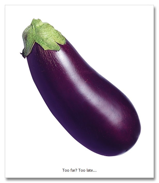
They also killed all the rad emoticons that WhatsApp has on other platforms, so I can no longer send my buddies the throbbing purple eggplant which has become a symbol for the undying bromance we have for one another.


Otherwise I don’t really know what to say when it comes to things that irritate me about the phone because there really aren’t many.

Oh, and did I mention the fact that if you’re SMSing someone you can dictate your sms and the phone tries to figure out what you just said and writes it for you? Here, check it, I’ll use that method to dictate the final paragraph of this review to the device and faithfully write the results below:

“The single most important question any decent fun give you answers is the question what up by this phone myself. Dancer in this case is yes I would buy the Lumia 800 and I would I really enjoyed using it. This is my goodbye sweet nakia lynia 800 I’d rather say well until we meet today.”

Um… not quite Siri is it? That was supposed to say:

“The single most important question that any decent phone review answers is the question, would I buy this phone myself? The answer in this case is yes, I would buy the Lumia 800 and I would really enjoy using it. This is not goodbye my sweet Lumia 800, but rather farewell until we meet again…”

Hope you enjoyed my Lumia 800 posts, if I had to wrap it all up on one sentence I’d say if you’re a Nokia fan and PC user, I can almost guarantee you’ll enjoy using the Lumia 800.

If you’re already an Apple convert, I’m not sure why you’re even reading this.

Finish your soy latte, jump on your fixie and ride into the sunset or you’ll be late for that underground gig that band no one’s ever heard of is playing in their mom’s basement.

-ST

12
Mar
12

Nokia Lumia 800 First Impressions

Nokia-Lumia-800I’m no tech-junkie, but like most guys I get excited by new gadgets and keep an eye on global and local trends when it comes to technology because it’s an inextricable part of our lives.

Having gone to the launch of the Nokia Lumia phones a few weeks back, I was keen to get my hands on a unit and try it out, so the kind folks at Nokia obliged and a review unit was delivered on Friday.

I waited for Saturday to start playing around with the phone and spent a good 4 hours setting it up and trying it out, so here are some of my first impressions of the Lumia 800.

Form Factor

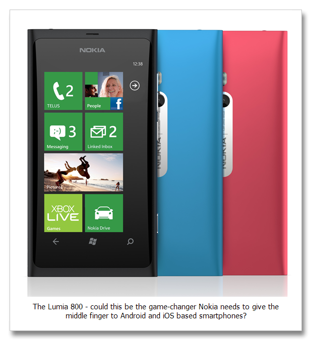
Ahh, form factor. The obligatory first step in any tech review. There isn’t much to say here except that the Lumia is dead sexy, fits comfotrably in the palm of your hand, is solid without being bulky or obtrusive and has a super sleek feel to it thanks to the curved glass touchscreen.

Its smooth one-piece body is completely buttonless except for the volume, lock and camera buttons on the right side of the phone. And speaking of the camera, Nokia made the genius decision to place the camera lens closer to the middle of the phone, thus reducing the risk of gigantic blurry fingers creeping into your pics.


It has 3 touch screen buttons along the bottom of the screen to go back, return to the home screen and search.

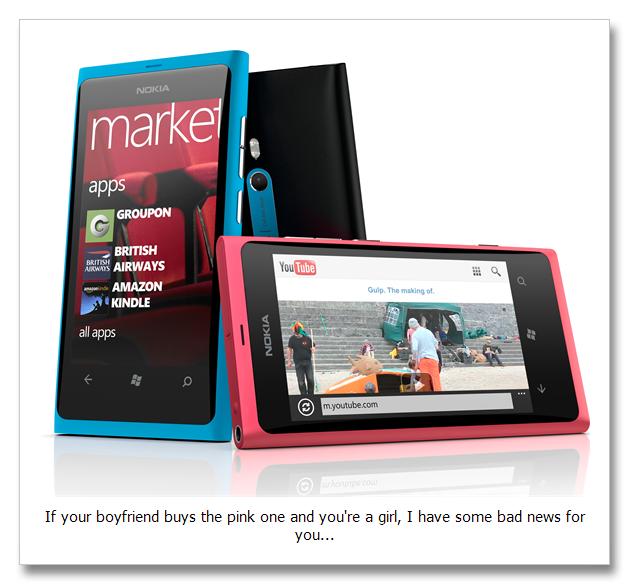
I got the cyan handset and I’ll be honest here and admit that the next time I’m in a meeting / hanging out with friends / sitting at home by myself I’ll definitely be whipping that bad boy out and putting it on the table in front of me all nonchalantly whilst silently congratulating myself for being such an awesome guy.


Micro SIM

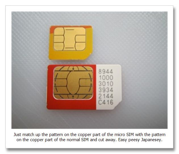
Like all new generation smartphones, the Lumia 800 uses a micro SIM instead of a normal one, something I found really frustrating when I was playing around with the Nokia N9 because it meant I had to pay R70 to get a micro SIM, do a SIM swap, wait 2 hours for it to go through and then throw my old SIM card away (it’s useless after the SIM swap), only to repeat the entire process in reverse after the review.

This time around I decided not to be a complete douche about it and just cut my normal SIM into a micro SIM using the micro SIM from my iPad as a template and it actually worked.


This came as a big surprise to me as I’d used a Stanley Knife and some hair scissors to do the job and thought I’d definitely botched it completely. Instead I NAILED IT, poured myself a whisky and silently congratulated myself for being such an awesome guy.

Firing it up

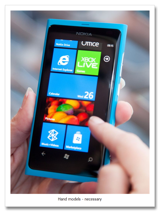
The first two things that struck me about the Lumia 800 were the responsiveness of the touch screen and how super-simple the menu navigation is.

You basically work entirely off two screens – your home screen that has all your tiles (these can be anything from apps to websites to calendar entries to email accounts) and the page you swipe right to that lists more tiles you can choose to pin to your homepage.


What I LOVED about the Lumia 800 is that it doesn’t keep every app / tile open in the background when you navigate to different places on the phone.

So when you hold down the back button and it brings up a screen with all your open tasks, unless you’ve been hitting the windows button to shortcut back to your home screen, you should only see one open task window.

Otherwise the back button is really all you need to navigate with. Genius in it’s simplicity!

People

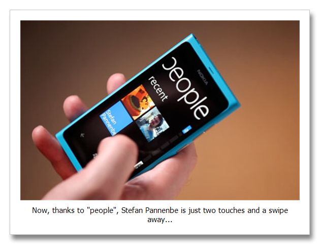
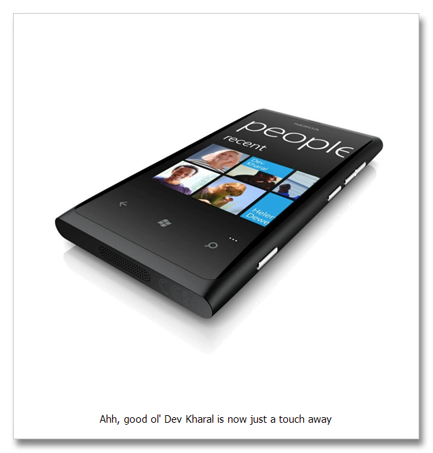
I’d heard about “people” at the Lumia launch and was dead keen to try this feature of the Windows 7 phone out. The idea is that you start by signing in to all your accounts (Windows Live / Hotmail, Gmail, Facebook, Twitter, X-Box Live, etc.) and with each successful sign in, your phone pulls all kinds of information from each account and starts populating your phone with contacts, posts, tweets and emails.

I found the experience completely seamless and surprisingly fun to go through (GeekTiger?). Of course, it will pull duplicate and sometimes triplicate contacts (I save all my friends on my phone SIM under their nicknames, so in some cases I had their Facebook details, their details from my SIM and their email addresses as three separate entries), but it’s dead easy to fix by just linking contacts.

In most cases the Lumia 800 correctly predicted who was who and suggested possible links, which made the whole process even simpler.


Thirty minutes later, a casual scroll through “people” revealed basically every human I’ve ever met in my ENTIRE LIFE, neatly organised with thumbnail pics for each entry. Opening a contact (like my good buddy Action, for example), now gives me the option to call him, SMS him, Facebook chat with him, write on his Facebook wall, mention him on Twitter, send him an email, map his home address, map his work address and visit his website.

It also tells me his job title, when his birthday is and who his “significant other” is, which made the stalker in me do backflips with joy.

Barring his childhood dreams and general philosophy on life, I know pretty much everything about Action now and with three touches can communicate with him in any number of ways.

The one thing that confused me though, and maybe I was being a retard, was that you aren’t given the option to chat with contacts using Gmail. What am I missing here guys? Help SlickRetard please.


That’s all the time we have for today’s Nokia Lumia 800 review. I’ll be writing a whole series of posts as I get into the nuts and bolts of this phone, but my initial impression and user experience has been pretty damn slick.

Which, when you’re SlickTiger, is where it’s at yo.

Peace.

-ST

01
Feb
12

The Tiger And The Nokia Lumia Launch

Nokia launchYou get jaded pretty quickly as a blogger – PR companies contact you to invite you to one launch event after the next, all of them promising events that will CHANGE YOUR LIFE FOREVER!

Fast forward to when you get there and you find a bunch of completely disinterested journos scratching their bums while they wait for the powerpoint presentation they know is going to follow with a look of mortal terror in their eyes.

You bolt as soon as it’s over and vow never, EVER again. Then you get the other kind of launch event, the kind that is awesome from start to finish like the Nokia Lumia launch I hit up last night.

Both the product and the event itself were noteworthy, but let me start with the product because gauging both from the launch and the buzz online at the moment,  Nokia’s new Lumia phones could very well be the game-changers Nokia needs to regain market share in the smartphone arena.


The Lumia 800 and 710 are Nokia’s first Windows Phones, both running Windows Phone 7.5 which, from the demo I was given at the event, looked like a MASSIVE improvement on previous versions of Windows I’ve used on phones like the HTC Touch 2 though, granted, that was a LONG time ago.

This time around, the folks at Microsoft have spent a LOT of time and effort thinking up ways to seamlessly merge all your accounts (Google, Twitter, Facebook, Windows Live, LinkedIn, etc.) so that communicating becomes as easy as selecting a person and choosing how you want to communicate with him / her.

Instead of a “call register” you can literally bring up your entire communication history with a person which lists, in chronological order, all the conversations you’ve had with that person whether they’re via email, sms, Facebook chat or over the phone.


The best part of it is because your “People” list is cloud-based, if you ever loose your phone, you will be able to pull all your contacts onto your new phone by simply logging into your Windows Live account – BADA BANG!

You can also log in to your X-Box Live account from your phone and communicate with your little gaming buddies whenever the fancy strikes you.

In case you’re interested, here are the specs for both phones so you can see what they’re packing under the hood:

Nokia Lumia 800: Stunningly social

  • Unibody design with vivid colors: cyan, magenta, black
  • Social networking provided by Windows Phone release 7.5
  • Internet Explorer 9 (hmmm… hope it’s better than the PC version…)
  • 3.7” AMOLED, ClearBlack display with WVGA 800×480 pixels, 16 million colours and 2.5D curved glass
  • Leading imaging capabilities with Carl Zeiss optics, above the lock capture, 8MP camera with autofocus and touch focus capability, dual LED flash, high definition 720p video recording with 30FPS and one touch image sharing
  • 1.4GHz Qualcomm Snapdragon processor, 512MB program memory, 16GB internal user memory, and up to 9 hours of 3G talktime


Nokia Lumia 710: Designed to be personal and affordable

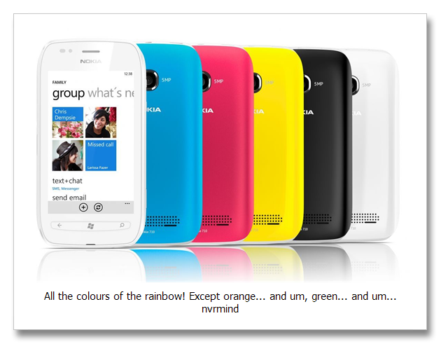
  • Can be personalized with white or black body design, five vibrant exchangeable back covers (black, white, cyan, fuchsia and yellow) and thousands of apps
  • Social networking provided by Windows Phone release 7.5
  • Again, Internet Explorer 9
  • 3.7” WVGA TFT, ClearBlack capacitive touch screen with pinch zoom, 800 x 480 pixels and 16 million colours
  • 5 MP camera with auto focus, LED flash, high definition 720p video recording with 30FPS and one-touch image sharing
  • 1.4GHz Qualcomm Snapdragon processor, 512MB program memory, 8GB internal user memory, and up to 7.6 hours of 3G talktime


And as for the event itself, it was like no launch I’ve ever seen.

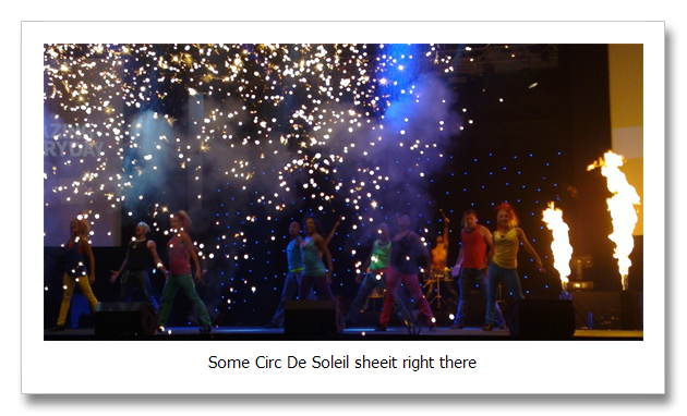
In between speeches by the head honchos at Nokia, Microsoft and Vodacom, a group of dancers ripped up the stage, accompanied by shirtless okes pounding drums and this guy who twirled a steel-framed cube whilst dancing in and around it.

Shows like that I usually find pretty nauseating to sit through, but I really enjoyed this one, which ended with all these cannons blasting confetti like gigantic snowflakes for a good 5 minutes before the DJs took to the decks and got the party officially started.


Which was when I left.

I would have loved to have stayed and partied on through the night, but as a general rule I don’t party on school nights because my internal organs don’t bounce back like they used to and going to work hungover is right up there with removing my teeth with pliers when it comes to my favourite experiences.

I am keen as a bean to get my hands on a Lumia 800 review unit so I can give you guys a better run-down of what it’s like to actually use one of these phones, but if the hype is to be believed, it will CHANGE YOUR LIFE FOREVER!

Only time. Will tell Winking smile

-ST