 I’ve had a lot of experience with the Nokia Lumia family. To date, I’ve reviewed the Lumia 800, 900, 920 and now the 925, so I’m becoming pretty well-versed when it comes to reviewing these phones.
However, for the sake of total transparency I need to say upfront that my experience using other smartphone handsets is limited as I’m not a fully qualified tech reviewer, just an average Joe who likes new technology.
So I can’t draw a comparison between this phone and others out there, but I can give an honest write-up of my experience using the phone so you can make an informed decision the next time you’re due for an upgrade.
So to kick things off, for this review all I’ll be focussing on are first impressions. In later reviews I’ll go more in-depth into the phone’s various features.
First Impressions
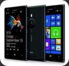
Straight off the bat, when I slipped the Lumia 925 out the box, I noticed a considerable size difference when compared to the 920.
The general trend with the higher-end Lumia phones so far seems to be based around making each phone bigger than the last. The 800 was a decent sized phone, but the bigger screen size of the 900 was undeniably sexier.
Then the 920 came out with an even bigger screen size, which was also cool, but it made the phone seriously hefty. Thing is, I enjoyed the experience of using the phone so much and was so impressed by it’s amazing image quality that I was willing to put up with its bulky feel.
The beauty of the Lumia 925 however is that it packs pretty much the same punch as the 920, but in a much, much smaller size.
The 925 is a whole 50g lighter (139g vs 185g) and it’s 0.2cm thinner (0.84cm vs 1.06cm), which makes an incredible difference it terms of the way the phone feels in your hand and the space it takes up in your pocket.
The screen size is identical in both phones though, as is the resolution (768 x 1280 pixels) and the pixel density (332) BUT a major differentiating factor is that the 925 has an AMOLED WXGA display as opposed to the IPS LCD display that the 920 was packing.
AMOLED displays offer a much larger colour gamut than IPS LCD displays, which makes images look more vibrant. AMOLED displays also have a wider viewing angle and are slightly easier on battery life so you’re winning on all fronts.
The other major difference looks-wise is that Nokia has opted to using aluminium for the edging that runs along the side of the phone which looks pretty damn sexy. The back is still polycarbonate, but with the 925 it’s done in a matt finish as opposed to the glossy finish the 920 had.
The camera has taken a bit of fire in some reviews because its placement means that your finger covers it when you’re holding the phone to talk, thus making it a magnet for fingerprints. Reviews have also lamented the fact that it’s slightly raised from the back of the phone, much like a welt on your bum after you’ve been shot with a paintball.
To be honest neither of these factors put a downer on my experience using this phone or its camera, but I can see how they might irritate highly strung users.
Like the other Lumia phones, the 925 has soft touch buttons for Back, Start and Search below the screen and hard touch (I just invented that term) buttons on the right-hand side for volume, power / lock and camera.
So far so good. At face value this is basically the 920, just slimmer and sexier. In the reviews to follow however, I’ll pop the hood on this bad boy and see how it really stacks up before I give my final verdict.
Stay tuned folks!
-ST


0 Responses to “The Tiger Gets His Paws On The Lumia 925, Reviews The Hell Out Of It”