 When Marko Ahtisaari, Nokia’s global head of design, began speaking at the Nokia N9 launch, the entire room went quiet.
Not because he was overbearing, not because he dominated the room with his presence, but because he spoke with a kind of humility that endeared him to his audience almost immediately.
Listening to him, I got the impression that he was carefully measuring every word as he spoke, yet his speech flowed so freely it felt like he was just shooting the breeze with us as he explained how he and his team designed the Nokia N9.
His bio notes that Marko is a keen observer of the patterns of human interaction and it’s through observing these basic patterns that he came up with some of the fundamental philosophies the N9 is based on.
Smartphones have changed the way we interact with one another and not all those changes have been positive. It’s become all too common to go out and see groups of friends or couples or families with their heads down, furiously communicating with everyone but the people they are sitting across from.
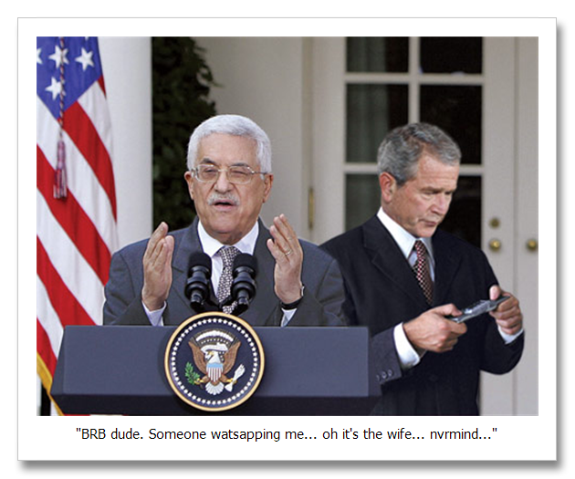
Marko’s main goal in designing the N9 is to give us that interaction back by designing a phone that’s so intuitive you can use it and still interact with the world and the people around you.
Back in the day Nokia phones had two great things going for them, you could use them with one hand and you could do that without having to glue your eyes to the screen.
Touch phones changed all that. Try typing an SMS on a touch screen phone without looking at the screen and the results would end up in an Autocorrect email before you knew what hit you.

Marko explained that the N9 is an attempt to create a user experience that doesn’t require you to put your life on hold every time you want to use your phone.
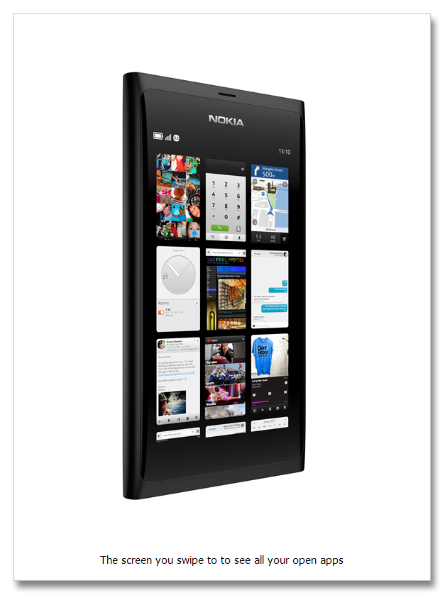
To borrow from the press release, one of the key features of the Nokia N9 is its ability to return users to the home screen from any open application by simply swiping from the edge of the device. It makes menu and application navigation extremely simple and slick which, combined with the fact that the N9 doesn’t have any physical buttons, all contributes to the overall look and feel of the product which I can tell you from using it first hand, is very impressive.
What really blew my mind though was the integration of Near Field Communication (NFC) into the N9. What this means, in layman’s terms, is that you can pair the phone with other NFC accessories like headphones and speakers by simply touching them together.
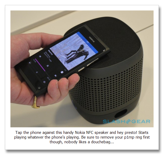
You can also share images and content with other NFC devices which means if I want to share a pic with you, I can literally tap my phone against yours and BANG! The pic transfers to your phone.
The only slight downside is the fact that they’ve downsized the camera from the monster 12 megapixels that the N8 comes packing to 8 megapixels in order to keep the design of the product more neat and tidy (the N8 camera is such a beast it actually protrudes from the body of the phone, so I can understand why they decided to go with something a little tidier for the N9).
BUT, like Marko pointed out to me when I spoke with him about the N9’s camera, the shot-to-shot time on the N9 is lightening fast and with a lens aperture of f/2.2 and dual LED flash it performs amazingly well in low light conditions.
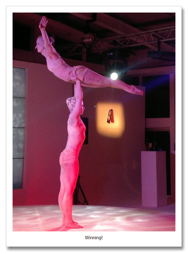
All in all, the N9 launch was definitely one of the more memorable launches I’ve been to recently. The champagne flowed endlessly, the horse doovers were delicious and the dancers who went up on stage to perform were even so kind as to spell out a “T†for Slicky-T.
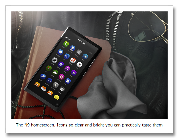
So watch this space boys and girls. Really hoping the kind folks at Nokia will hook a brother up with the N9 so I can give you a better idea of how this sexy little piece of technology actually performs, but until then, here are some more pics to drool over.
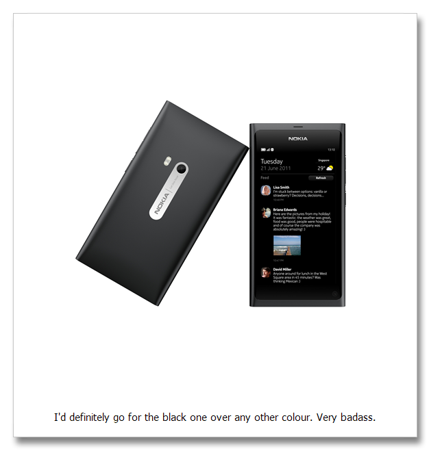
Have a killer weekend party people, see you on the other side ![]()
-ST



0 Responses to “The Tiger Hits Up The Nokia N9 Launch, Champagne Ensues…”